

通过本文主要向大家介绍了python,matplotlib等相关知识,希望对您有所帮助,也希望大家支持linkedu.com www.linkedu.com
前几天无意中看到了一片文章,《用 Python 爬了爬自己的微信朋友(实例讲解)》,这篇文章写的是使用python中的itchat爬取微信中朋友的信息,其中信息包括,昵称、性别、地理位置等,然后对这些信息进行统计并且以图像形式显示。文章对itchat的使用写的很详细,但是代码是贴图,画图使用R中的包画,我对着做了一遍,并且把他没有贴画图的代码做了一遍,画图是使用matplotlib。由于他没有贴代码,所以我把我写的贴出来供以后复制。
首先是安装itchat的包,可以使用清华大学的镜像:pip install -i https://pypi.tuna.tsinghua.edu.cn/simple itchat
爬取微信好友男女比例:
import itchat

itchat.login()
friends=itchat.get_friends(update=True)[0:]
male=female=other=0
for i in friends[1:]:
 sex=i['Sex']
 if sex==1:
  male+=1
 elif sex==2:
  female+=1
 else:
  other+=1

total=len(friends[1:])
malecol=round(float(male)/total*100,2)
femalecol=round(float(female)/total*100,2)
othercol=round(float(other)/total*100,2)
print('男性朋友:%.2f%%' %(malecol)+'\n'+
'女性朋友:%.2f%%' % (femalecol)+'\n'+
'性别不明的好友:%.2f%%' %(othercol))
print("显示图如下:")
画图:柱状图和饼状图,图片如下:
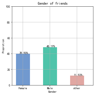

import numpy as np
import matplotlib.pyplot as plt
import matplotlib as mpl
#解决中文乱码不显示问题
mpl.rcParams['font.sans-serif'] = ['SimHei'] #指定默认字体
mpl.rcParams['axes.unicode_minus'] = False #解决保存图像是负号'-'显示为方块的问题

map = {
 'Female': (malecol, '#7199cf'),
 'Male': (femalecol, '#4fc4aa'),
 'other': (othercol, '#e1a7a2')
}

fig = plt.figure(figsize=(5,5))# 整体图的标题
ax = fig.add_subplot(111)#添加一个子图
ax.set_title('Gender of friends')

xticks = np.arange(3)+0.15# 生成x轴每个元素的位置
bar_width = 0.5# 定义柱状图每个柱的宽度
names = map.keys()#获得x轴的值
values = [x[0] for x in map.values()]# y轴的值
colors = [x[1] for x in map.values()]# 对应颜色

bars = ax.bar(xticks, values, width=bar_width, edgecolor='none')# 画柱状图,横轴是x的位置,纵轴是y,定义柱的宽度,同时设置柱的边缘为透明
ax.set_ylabel('Proprotion')# 设置标题
ax.set_xlabel('Gender')
ax.grid()#打开网格
ax.set_xticks(xticks)# x轴每个标签的具体位置
ax.set_xticklabels(names)# 设置每个标签的名字
ax.set_xlim([bar_width/2-0.5, 3-bar_width/2])# 设置x轴的范围
ax.set_ylim([0, 100])# 设置y轴的范围
for bar, color in zip(bars, colors):
 bar.set_color(color)# 给每个bar分配指定的颜色
 height=bar.get_height()#获得高度并且让字居上一点
 plt.text(bar.get_x()+bar.get_width()/4.,height,'%.2f%%' %float(height))#写值
plt.show()
#画饼状图
fig1 = plt.figure(figsize=(5,5))# 整体图的标题
ax = fig1.add_subplot(111)
ax.set_title('Pie chart')
labels = ['{}\n{} %'.format(name, value) for name, value in zip(names, values)]
ax.pie(values, labels=labels, colors=colors)#并指定标签和对应颜色
plt.show()
爬取其他信息,对省份分类并根据个数对其排序
#用来爬去各个变量
def get_var(var):
 variable=[]
 for i in friends:
  value=i[var]
  variable.append(value)
 return variable

#调用函数得到各个变量,并把数据存到csv文件中,保存到桌面
NickName=get_var('NickName')
Sex=get_var('Sex')
Province=get_var('Province')
City=get_var('City')
Signature=get_var('Signature')

pros=set(Province)#去重
prosarray=[]
for item in pros:
 prosarray.append((item,Province.count(item)))#获取个数
def by_num(p):
 return p[1]
prosdsored=sorted(prosarray,key=by_num,reverse=True)#根据个数排序
画省份图:

#画图
figpro = plt.figure(figsize=(10,5))# 整体图的标题
axpro = figpro.add_subplot(111)#添加一个子图
axpro.set_title('Province')
xticks = np.linspace(0.5,20,20)# 生成x轴每个元素的位置
bar_width = 0.8# 定义柱状图每个柱的宽度
pros=[]
values = []
count=0
for item in prosdsored:
 pros.append(item[0])
 values.append(item[1])
 count=count+1
 if count>=20:
  break

colors = ['#FFEC8B','#FFE4C4','#FFC125','#FFB6C1','#CDCDB4','#CDC8B1','#CDB79E','#CDAD00','#CD96CD','#CD853F','#C1FFC1','#C0FF3E','#BEBEBE','#CD5C5C','#CD3700','#CD2626','#8B8970','#8B6914','#8B5F65','#8B2252']# 对应颜色

bars = axpro.bar(xticks, values, width=bar_width, edgecolor='none')
axpro.set_ylabel('人数')# 设置标题
axpro.set_xlabel('省份')
axpro.grid()#打开网格
axpro.set_xticks(xticks)# x轴每个标签的具体位置
axpro.set_xticklabels(pros)# 设置每个标签的名字
axpro.set_xlim(0,20)# 设置x轴的范围
axpro.set_ylim([0, 100])# 设置y轴的范围

for bar, color in zip(bars, colors):
 bar.set_color(color)# 给每个bar分配指定的颜色
 height=bar.get_height()#获得高度并且让字居上一点
 plt.text(bar.get_x()+bar.get_width()/4.,height,'%.d' %float(height))#写值

plt.show()
还可以对数据进行保存:可用excel打开
#保存数据
from pandas import DataFrame
data={'NickName':NickName,'Sex':Sex,'Province':Province,'City':City,'Signature':Signature}
frame=DataFrame(data)

frame.to_csv('data.csv',index=True)
以上这篇itchat和matplotlib的结合使用爬取微信信息的实例就是小编分享给大家的全部内容了,希望能给大家一个参考,也希望大家多多支持。